 Image Gallery GridA clean, responsive gallery with customizable layouts.Gallery

What you can change
Sticky Text Column
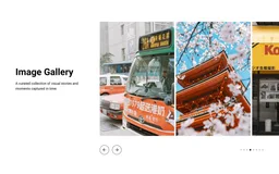
The text panel stays fixed on desktop so the text stays visible while visitors browse the images.
Fractional Slide Count
Show 1, 1.5, or 2 slides at once. Fractional values let the next image peek into view, hinting there's more to explore.
Responsive Layout
On mobile, text stacks above the slider and arrow buttons hide. Users swipe naturally and pagination dots keep orientation clear.
Layout and Style Controls
Adjustable column split (30–70%), per-image links, slide gap, full desktop/mobile padding controls, and independent typography settings for heading and description.
Accessibility
Semantic HTML with ARIA labels on navigation elements and proper image alt attributes.
props-slider-gallery.liquid
{%- comment -%} Image Slider with Text | PROPS — https://props.tools/{%- endcomment -%} {% schema %}{ "name": "Image Slider with Text", "tag": "section", "class": "props-slider-gallery", "disabled_on": { "groups": ["header", "custom.popups"] }, "settings": [ { "type": "header", "content": "Layout" }, { "type": "range", "id": "desktop_text_width", "min": 30, "max": 70, "step": 1, "unit": "%", "label": "Text Column Width (Desktop)", "default": 40 }, { "type": "header", "content": "Content" }, { "type": "text", "id": "heading", "label": "Heading", "default": "Image Gallery" }, { "type": "richtext", "id": "description", "label": "Description", "default": "<p>A curated collection of visual stories and moments captured in time.</p>" }, { "type": "select", "id": "text_alignment", "label": "Text Alignment (Mobile)", "options": [ { "value": "left", "label": "Left" }, { "value": "center", "label": "Center" } ], "default": "center" }, { "type": "header", "content": "Typography" }, { "type": "range", "id": "heading_size_desktop", "min": 24, "max": 80, "step": 2, "unit": "px", "label": "Heading Size", "default": 40 }, { "type": "range", "id": "heading_size_mobile", "min": 20, "max": 48, "step": 2, "unit": "px", "label": "Heading Size (Mobile)", "default": 32 }, { "type": "range", "id": "description_size_desktop", "min": 12, "max": 24, "step": 1, "unit": "px", "label": "Description Size", "default": 18 }, { "type": "range", "id": "description_size_mobile", "min": 12, "max": 20, "step": 1, "unit": "px", "label": "Description Size (Mobile)", "default": 16 }, { "type": "header", "content": "Slider Settings" }, { "type": "checkbox", "id": "show_dots", "label": "Show Pagination Dots", "default": true }, { "type": "range", "id": "slides_desktop", "min": 1, "max": 3, "step": 0.1, "label": "Slides to Show (Desktop)", "default": 1 }, { "type": "range", "id": "slides_mobile", "min": 1, "max": 2, "step": 0.1, "label": "Slides to Show (Mobile)", "default": 1 }, { "type": "header", "content": "Spacing" }, { "type": "range", "id": "column_gap", "min": 0, "max": 100, "step": 4, "unit": "px", "label": "Gap between Columns", "default": 48 }, { "type": "range", "id": "slide_gap", "min": 0, "max": 40, "step": 2, "unit": "px", "label": "Gap between Slides", "default": 16 }, { "type": "header", "content": "Section Padding" }, { "type": "range", "id": "padding_vertical_desktop", "min": 0, "max": 120, "step": 4, "unit": "px", "label": "Vertical Padding", "default": 80 }, { "type": "range", "id": "padding_horizontal_desktop", "min": 0, "max": 120, "step": 4, "unit": "px", "label": "Horizontal Padding", "default": 40 }, { "type": "range", "id": "padding_vertical_mobile", "min": 0, "max": 80, "step": 4, "unit": "px", "label": "Vertical Padding (Mobile)", "default": 40 }, { "type": "range", "id": "padding_horizontal_mobile", "min": 0, "max": 80, "step": 4, "unit": "px", "label": "Horizontal Padding (Mobile)", "default": 20 }, { "type": "header", "content": "Colors" }, { "type": "color", "id": "bg_color", "label": "Background Color", "default": "transparent" }, { "type": "color", "id": "text_color", "label": "Text Color", "default": "#121212" } ], "blocks": [ { "type": "image", "name": "Image", "settings": [ { "type": "image_picker", "id": "image", "label": "Image" }, { "type": "text", "id": "alt_text", "label": "Alt Text" }, { "type": "url", "id": "link", "label": "Link" } ] } ], "presets": [ { "name": "Image Slider with Text", "blocks": [ { "type": "image" }, { "type": "image" }, { "type": "image" } ] } ]}{% endschema %} {% style %} .props-slider-gallery-{{ section.id }} { background-color: {{ section.settings.bg_color }}; padding-top: {{ section.settings.padding_vertical_mobile }}px; padding-bottom: {{ section.settings.padding_vertical_mobile }}px; color: {{ section.settings.text_color }}; --props-pd-h-m: {{ section.settings.padding_horizontal_mobile }}px; --props-pd-h-d: {{ section.settings.padding_horizontal_desktop }}px; --props-text-align: {{ section.settings.text_alignment }}; --props-column-gap: {{ section.settings.column_gap }}px; --props-slide-gap: {{ section.settings.slide_gap }}px; --props-slides-show: {{ section.settings.slides_mobile }}; --props-heading-size: {{ section.settings.heading_size_mobile }}px; --props-body-size: {{ section.settings.description_size_mobile }}px; } @media screen and (min-width: 750px) { .props-slider-gallery-{{ section.id }} { padding-top: {{ section.settings.padding_vertical_desktop }}px; padding-bottom: {{ section.settings.padding_vertical_desktop }}px; --props-slides-show: {{ section.settings.slides_desktop }}; --props-heading-size: {{ section.settings.heading_size_desktop }}px; --props-body-size: {{ section.settings.description_size_desktop }}px; } } .props-slider-gallery-container { width: 100%; max-width: var(--page-width, 1200px); margin: 0 auto; padding-left: var(--props-pd-h-m); padding-right: var(--props-pd-h-m); box-sizing: border-box; display: flex; flex-direction: column; gap: 32px; } @media screen and (min-width: 750px) { .props-slider-gallery-container { padding-left: var(--props-pd-h-d); padding-right: var(--props-pd-h-d); flex-direction: row; align-items: flex-start; gap: var(--props-column-gap); } } @media screen and (max-width: 750px) { .props-slider-gallery-content { flex: 0 0 100%; text-align: var(--props-text-align); } } @media screen and (min-width: 750px) { .props-slider-gallery-{{ section.id }} .props-slider-gallery-content { flex: 0 0 {{ section.settings.desktop_text_width }}%; position: sticky; top: 40px; } } .props-slider-gallery-heading { color: inherit; margin: 0 0 16px 0; font-size: var(--props-heading-size); line-height: 1.2; } .props-slider-gallery-description { margin: 0; } .props-slider-gallery-description p { margin: 0 0 16px 0; font-size: var(--props-body-size); line-height: 1.5; opacity: 0.9; } .props-slider-gallery-description a { color: inherit; text-decoration: underline; text-underline-offset: 0.3em; } .props-slider-gallery-description p:last-child { margin-bottom: 0; } .props-slider-gallery-slider-wrapper { flex: 1; min-width: 0; display: flex; flex-direction: column; } .props-slider-gallery-slider { display: flex; overflow-x: auto; scroll-snap-type: x mandatory; scroll-behavior: smooth; scrollbar-width: none; gap: var(--props-slide-gap); padding-bottom: 4px; } .props-slider-gallery-slider::-webkit-scrollbar { display: none; } @media (prefers-reduced-motion: reduce) { .props-slider-gallery-slider { scroll-behavior: auto; } } .props-slider-gallery-item { flex: 0 0 calc((100% - (var(--props-slide-gap) * (var(--props-slides-show) - 1))) / var(--props-slides-show)); scroll-snap-align: start; position: relative; } .props-slider-gallery-media { width: 100%; aspect-ratio: auto; display: block; overflow: hidden; } .props-slider-gallery-media img, .props-slider-gallery-media svg { width: 100%; height: auto; object-fit: contain; display: block; } .props-slider-gallery-placeholder { aspect-ratio: 1200 / 630; } .props-slider-gallery-controls { margin-top: 24px; display: flex; align-items: center; justify-content: space-between; } @media screen and (max-width: 749px) { .props-slider-gallery-nav { display: none !important; } .props-slider-gallery-controls { justify-content: center !important; } } .props-slider-gallery-nav { display: flex; gap: 12px; } .props-slider-gallery-arrow { width: 44px; height: 44px; border-radius: 50%; border: 1px solid currentColor; background: transparent; color: inherit; display: flex; align-items: center; justify-content: center; cursor: pointer; padding: 0; transition: opacity 0.2s ease; } .props-slider-gallery-arrow:hover { opacity: 0.6; } .props-slider-gallery-arrow svg { width: 20px; height: 20px; } .props-slider-gallery-dots { display: flex; gap: 8px; } .props-slider-gallery-dot { width: 8px; height: 8px; border-radius: 50%; background: currentColor; opacity: 0.2; border: none; padding: 0; cursor: pointer; transition: opacity 0.2s ease; } .props-slider-gallery-dot.active { opacity: 1; } .props-slider-gallery-link { position: absolute; inset: 0; z-index: 2; } .props-slider-gallery-link:focus-visible { outline: 2px solid #FFFFFF; outline-offset: -4px; box-shadow: inset 0 0 0 2px #121212; }{% endstyle %} <div class="props-slider-gallery-{{ section.id }}" data-section-type="props-slider-gallery" data-section-id="{{ section.id }}"> <div class="props-slider-gallery-container"> <div class="props-slider-gallery-content"> {% if section.settings.heading != blank %} <h2 class="props-slider-gallery-heading">{{ section.settings.heading | escape }}</h2> {% endif %} {% if section.settings.description != blank %} <div class="props-slider-gallery-description">{{ section.settings.description }}</div> {% endif %} </div> <div class="props-slider-gallery-slider-wrapper"> <div class="props-slider-gallery-slider" id="Slider-{{ section.id }}"> {% for block in section.blocks %} <div class="props-slider-gallery-item" {{ block.shopify_attributes }}> <div class="props-slider-gallery-media"> {% if block.settings.image != blank %} {{ block.settings.image | image_url: width: 1400 | image_tag: loading: 'lazy', class: 'props-slider-gallery-img', alt: block.settings.alt_text | default: block.settings.image.alt, widths: '400, 600, 800, 1000, 1200, 1400', sizes: '(min-width: 750px) 50vw, 100vw' }} {% else %} {{ 'image' | placeholder_svg_tag: 'props-slider-gallery-img props-slider-gallery-placeholder' | replace: '<svg', '<svg aria-hidden="true" focusable="false"' }} {% endif %} </div> {% if block.settings.link != blank %} <a href="{{ block.settings.link }}" class="props-slider-gallery-link" aria-label="{{ block.settings.alt_text | default: block.settings.image.alt | default: 'View gallery item' | escape }}"></a> {% endif %} </div> {% endfor %} </div> <div class="props-slider-gallery-controls"> <div class="props-slider-gallery-nav"> <button type="button" class="props-slider-gallery-arrow" id="Prev-{{ section.id }}" aria-label="Previous slide"> <svg aria-hidden="true" focusable="false" viewBox="0 0 24 24" fill="none" stroke="currentColor" stroke-width="2"><path d="M15 18l-6-6 6-6"/></svg> </button> <button type="button" class="props-slider-gallery-arrow" id="Next-{{ section.id }}" aria-label="Next slide"> <svg aria-hidden="true" focusable="false" viewBox="0 0 24 24" fill="none" stroke="currentColor" stroke-width="2"><path d="M9 18l6-6-6-6"/></svg> </button> </div> {% if section.settings.show_dots %} <div class="props-slider-gallery-dots" id="Dots-{{ section.id }}"> {% for block in section.blocks %} <button type="button" class="props-slider-gallery-dot {% if forloop.first %}active{% endif %}" data-index="{{ forloop.index0 }}" aria-label="Go to slide {{ forloop.index }}"></button> {% endfor %} </div> {% endif %} </div> </div> </div></div> {% javascript %}(function() { const init = (container) => { const id = container.getAttribute('data-section-id'); if (!id) return; const slider = document.getElementById('Slider-' + id); const nextBtn = document.getElementById('Next-' + id); const prevBtn = document.getElementById('Prev-' + id); const dots = document.querySelectorAll('#Dots-' + id + ' .props-slider-gallery-dot'); if (!slider) return; const scrollBehavior = () => (window.matchMedia('(prefers-reduced-motion: reduce)').matches ? 'auto' : 'smooth'); const getItemStep = () => { const gap = parseInt(getComputedStyle(slider).getPropertyValue('gap') || 0); const item = slider.querySelector('.props-slider-gallery-item'); return item ? item.offsetWidth + gap : 0; }; const updateUI = () => { const step = getItemStep(); if (!step) return; const index = Math.round(slider.scrollLeft / step); dots.forEach((dot, i) => dot.classList.toggle('active', i === index)); }; if (nextBtn) { nextBtn.addEventListener('click', () => { const step = getItemStep(); if (step) slider.scrollBy({ left: step, behavior: scrollBehavior() }); }); } if (prevBtn) { prevBtn.addEventListener('click', () => { const step = getItemStep(); if (step) slider.scrollBy({ left: -step, behavior: scrollBehavior() }); }); } let scrollTimeout; slider.addEventListener('scroll', () => { clearTimeout(scrollTimeout); scrollTimeout = setTimeout(updateUI, 30); }); dots.forEach((dot, i) => { dot.addEventListener('click', () => { const step = getItemStep(); if (step) slider.scrollTo({ left: i * step, behavior: scrollBehavior() }); }); }); }; document.querySelectorAll('[data-section-type="props-slider-gallery"]').forEach(init); document.addEventListener('shopify:section:load', (e) => { const container = e.target.querySelector('[data-section-type="props-slider-gallery"]'); if (container) init(container); });})();{% endjavascript %}before you paste
Questions,
answered.
Do I need an app to add the Image Slider with Text?
No. The Image Slider with Text is one Liquid file, props-slider-gallery.liquid, that you add to your theme’s code. Its styles, and its script where it has one, live inside that file, so there’s nothing to install and no monthly fee.
How many images show at once?
One by default. Slides to Show goes up to three on desktop and two on mobile, and the text column takes 30% to 70% of the width on desktop.
Will it work with my theme?
It works with Online Store 2.0 themes, the kind that let you add sections to any page from the theme editor. We test every section on Dawn. If it clashes with your theme, use Report an issue at the top of this page.
More like this
All sectionsImage Gallery GridA clean, responsive gallery with customizable layouts.Gallery