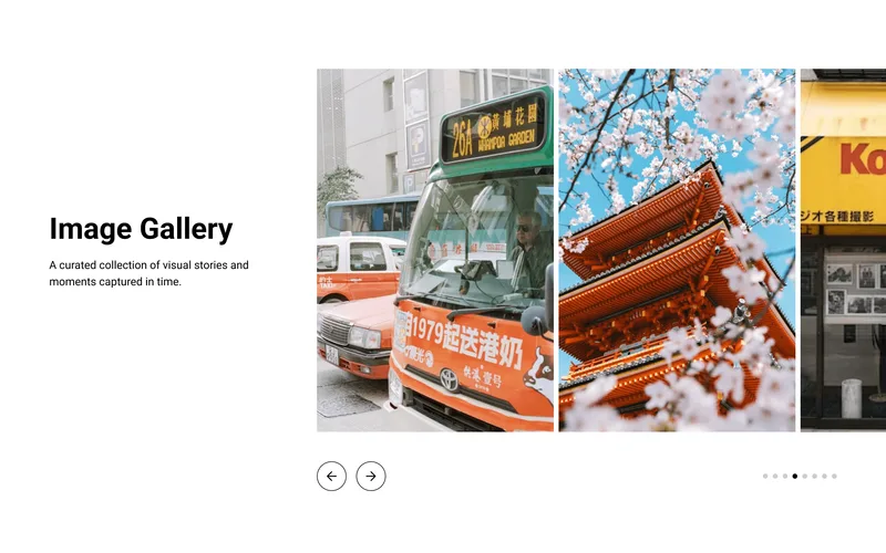
 Image Slider with TextA two-column section with a horizontal image slider.GalleryOct 2026
What you can change
Responsive Grid
Set 2–6 columns on desktop, 1–3 on mobile with separate column and gap controls for each breakpoint.
Aspect Ratio Control
Choose from Auto, Square (1:1), Portrait (2:3), Landscape (3:2), or Widescreen (16:9) for consistent image sizing across the grid.
Mobile Swipe Mode
Converts the grid into a horizontal carousel on mobile with pagination dots — great for product showcases and lookbooks.
Customizability
Independent grid gap and section padding for desktop and mobile. Caption display mode (hover overlay or below image), font size, alignment, background color, caption color, overlay color with opacity, and per-image links.
Accessibility
Semantic HTML with proper image alt attributes and ARIA labels on all interactive elements.
props-gallery.liquid
{%- comment -%} Image Gallery Grid | PROPS — https://props.tools/{%- endcomment -%} {% schema %}{ "name": "Image Gallery Grid", "tag": "section", "class": "props-gallery", "disabled_on": { "groups": ["header", "custom.popups"] }, "settings": [ { "type": "header", "content": "Layout" }, { "type": "range", "id": "cols_desktop", "min": 2, "max": 6, "step": 1, "label": "Columns", "default": 4 }, { "type": "range", "id": "cols_mobile", "min": 1, "max": 3, "step": 1, "label": "Columns (Mobile)", "default": 2 }, { "type": "checkbox", "id": "enable_swipe", "label": "Enable Swipe on Mobile", "default": false }, { "type": "checkbox", "id": "show_dots", "label": "Show Pagination Dots", "default": true, "info": "Only visible when swipe is enabled." }, { "type": "header", "content": "Image Settings" }, { "type": "select", "id": "aspect_ratio", "label": "Image Aspect Ratio", "options": [ { "value": "auto", "label": "Auto (Original)" }, { "value": "1/1", "label": "Square (1:1)" }, { "value": "2/3", "label": "Portrait (2:3)" }, { "value": "3/2", "label": "Landscape (3:2)" }, { "value": "16/9", "label": "Widescreen (16:9)" } ], "default": "1/1" }, { "type": "header", "content": "Spacing" }, { "type": "range", "id": "gap_desktop", "min": 0, "max": 100, "step": 4, "unit": "px", "label": "Grid Gap", "default": 8 }, { "type": "range", "id": "gap_mobile", "min": 0, "max": 60, "step": 2, "unit": "px", "label": "Grid Gap (Mobile)", "default": 4 }, { "type": "header", "content": "Caption Settings" }, { "type": "select", "id": "caption_position", "label": "Caption Position", "options": [ { "value": "overlay", "label": "Overlay" }, { "value": "below", "label": "Below Image" } ], "default": "overlay" }, { "type": "select", "id": "text_align", "label": "Text Alignment", "info": "Applies when caption is below image.", "options": [ { "value": "left", "label": "Left" }, { "value": "center", "label": "Center" } ], "default": "center" }, { "type": "range", "id": "caption_size_desktop", "min": 10, "max": 40, "step": 1, "unit": "px", "label": "Font Size", "default": 16 }, { "type": "range", "id": "caption_size_mobile", "min": 10, "max": 30, "step": 1, "unit": "px", "label": "Font Size (Mobile)", "default": 14 }, { "type": "header", "content": "Section Padding" }, { "type": "range", "id": "padding_vertical_desktop", "min": 0, "max": 120, "step": 4, "unit": "px", "label": "Vertical Padding", "default": 40 }, { "type": "range", "id": "padding_horizontal_desktop", "min": 0, "max": 120, "step": 4, "unit": "px", "label": "Horizontal Padding", "default": 40 }, { "type": "range", "id": "padding_vertical_mobile", "min": 0, "max": 80, "step": 4, "unit": "px", "label": "Vertical Padding (Mobile)", "default": 20 }, { "type": "range", "id": "padding_horizontal_mobile", "min": 0, "max": 80, "step": 4, "unit": "px", "label": "Horizontal Padding (Mobile)", "default": 20 }, { "type": "header", "content": "Colors" }, { "type": "color", "id": "bg_color", "label": "Background Color", "default": "transparent" }, { "type": "color", "id": "text_color", "label": "Caption Color", "default": "#FFFFFF" }, { "type": "color", "id": "overlay_bg", "label": "Overlay Background", "default": "#000000", "info": "Only applies to overlay style." }, { "type": "range", "id": "overlay_opacity", "min": 0, "max": 100, "step": 5, "unit": "%", "label": "Overlay Opacity", "default": 0 } ], "blocks": [ { "type": "image", "name": "Image", "settings": [ { "type": "image_picker", "id": "image", "label": "Image" }, { "type": "url", "id": "link", "label": "Link" }, { "type": "text", "id": "caption", "label": "Caption" } ] } ], "presets": [ { "name": "Image Gallery Grid", "blocks": [ { "type": "image" }, { "type": "image" }, { "type": "image" }, { "type": "image" } ] } ]}{% endschema %} {% style %} .props-gallery-{{ section.id }} { background-color: {{ section.settings.bg_color }}; padding-top: {{ section.settings.padding_vertical_mobile }}px; padding-bottom: {{ section.settings.padding_vertical_mobile }}px; --props-pd-h-m: {{ section.settings.padding_horizontal_mobile }}px; --props-pd-h-d: {{ section.settings.padding_horizontal_desktop }}px; --props-grid-gap: {{ section.settings.gap_mobile }}px; --props-grid-cols: {{ section.settings.cols_mobile }}; --props-font-size: {{ section.settings.caption_size_mobile }}px; --props-overlay-color: {{ section.settings.overlay_bg }}; --props-overlay-opacity: {{ section.settings.overlay_opacity | divided_by: 100.0 }}; --props-text-color: {{ section.settings.text_color }}; } @media screen and (min-width: 750px) { .props-gallery-{{ section.id }} { padding-top: {{ section.settings.padding_vertical_desktop }}px; padding-bottom: {{ section.settings.padding_vertical_desktop }}px; --props-grid-gap: {{ section.settings.gap_desktop }}px; --props-grid-cols: {{ section.settings.cols_desktop }}; --props-font-size: {{ section.settings.caption_size_desktop }}px; } } .props-gallery-container { width: 100%; max-width: var(--page-width, 1200px); margin: 0 auto; padding-left: var(--props-pd-h-m); padding-right: var(--props-pd-h-m); box-sizing: border-box; } @media screen and (min-width: 750px) { .props-gallery-container { padding-left: var(--props-pd-h-d); padding-right: var(--props-pd-h-d); } } .props-gallery-grid { display: grid; grid-template-columns: repeat(var(--props-grid-cols), 1fr); gap: var(--props-grid-gap); width: 100%; } .props-gallery-item { position: relative; display: block; text-decoration: none; color: inherit; overflow: hidden; cursor: default; } .props-gallery-item.has-link { cursor: pointer; } .props-gallery-media { position: relative; width: 100%; overflow: hidden; display: block; backface-visibility: hidden; {% unless section.settings.aspect_ratio == 'auto' %} aspect-ratio: {{ section.settings.aspect_ratio }}; {% endunless %} } .props-gallery-img { width: 100%; height: 100%; display: block; object-fit: cover; transition: transform 0.3s cubic-bezier(0.25, 0.46, 0.45, 0.94); will-change: transform; {% unless section.settings.aspect_ratio == 'auto' %} position: absolute; top: 0; left: 0; {% endunless %} } .props-gallery-placeholder { aspect-ratio: 1200 / 630; height: auto; } @media (hover: hover) { .props-gallery-item.has-link:hover .props-gallery-img { transform: scale(1.04); } } .props-gallery-caption { font-size: var(--props-font-size); color: var(--props-text-color); line-height: 1.3; width: 100%; box-sizing: border-box; z-index: 2; position: relative; pointer-events: none; } {% if section.settings.caption_position == 'overlay' %} .props-gallery-overlay-bg { position: absolute; inset: 0; background-color: var(--props-overlay-color); opacity: 0; transition: opacity 0.3s ease; z-index: 1; pointer-events: none; } .props-gallery-caption { position: absolute; inset: 0; display: flex; flex-direction: column; justify-content: center; align-items: center; text-align: center; padding: 16px; opacity: 0; transition: opacity 0.3s ease; } .props-gallery-item:hover .props-gallery-overlay-bg { opacity: var(--props-overlay-opacity); } .props-gallery-item:hover .props-gallery-caption { opacity: 1; } {% else %} .props-gallery-caption { margin-top: 12px; text-align: {{ section.settings.text_align }}; color: {{ section.settings.text_color }}; } {% endif %} {% if section.settings.enable_swipe %} @media screen and (max-width: 749px) { .props-gallery-grid.props-gallery-swipe { display: flex; overflow-x: auto; scroll-snap-type: x mandatory; padding-bottom: 24px; scrollbar-width: none; gap: var(--props-grid-gap); } .props-gallery-grid.props-gallery-swipe::-webkit-scrollbar { display: none; } .props-gallery-grid.props-gallery-swipe .props-gallery-item { flex: 0 0 70vw; width: 70vw; scroll-snap-align: center; } .props-gallery-dots { display: flex; justify-content: center; gap: 8px; margin-top: 8px; width: 100%; } .props-gallery-dot { width: 8px; height: 8px; border-radius: 50%; border: none; padding: 0; background-color: currentColor; opacity: 0.2; transition: opacity 0.2s; cursor: pointer; } .props-gallery-dot.active { opacity: 1; } } @media screen and (min-width: 750px) { .props-gallery-dots { display: none; } } {% else %} .props-gallery-dots { display: none; } {% endif %}{% endstyle %} <div class="props-gallery-{{ section.id }}" data-section-type="props-gallery" data-section-id="{{ section.id }}"> <div class="props-gallery-container"> <div class="props-gallery-grid {% if section.settings.enable_swipe %}props-gallery-swipe{% endif %}" id="props-gallery-grid-{{ section.id }}" > {% for block in section.blocks %} {%- liquid assign has_link = false if block.settings.link != blank assign has_link = true endif -%} <div class="props-gallery-item {% if has_link %}has-link{% endif %}" {{ block.shopify_attributes }}> {%- if has_link -%} <a href="{{ block.settings.link }}" class="props-gallery-media-wrapper" style="display: contents;"> {%- else -%} <div class="props-gallery-media-wrapper" style="display: contents;"> {%- endif -%} <div class="props-gallery-media"> {% if block.settings.image != blank %} {{ block.settings.image | image_url: width: 1200 | image_tag: loading: 'lazy', class: 'props-gallery-img', widths: '375, 550, 750, 1100, 1500', sizes: '(min-width: 750px) 25vw, 70vw' }} {% else %} {{ 'image' | placeholder_svg_tag: 'props-gallery-img props-gallery-placeholder' | replace: '<svg', '<svg aria-hidden="true" focusable="false"' }} {% endif %} {%- if section.settings.caption_position == 'overlay' -%} <div class="props-gallery-overlay-bg"></div> {%- if block.settings.caption != blank -%} <div class="props-gallery-caption"> <span>{{ block.settings.caption | escape }}</span> </div> {%- endif -%} {%- endif -%} </div> {%- if has_link -%} </a> {%- else -%} </div> {%- endif -%} {%- if section.settings.caption_position == 'below' and block.settings.caption != blank -%} <div class="props-gallery-caption"> {{ block.settings.caption | escape }} </div> {%- endif -%} </div> {% endfor %} </div> {% if section.settings.enable_swipe and section.settings.show_dots %} <div class="props-gallery-dots" id="props-gallery-dots-{{ section.id }}"> {% for block in section.blocks %} <button type="button" class="props-gallery-dot {% if forloop.first %}active{% endif %}" data-index="{{ forloop.index0 }}" aria-label="Go to image {{ forloop.index }}"></button> {% endfor %} </div> {% endif %} </div></div> {% javascript %}(function() { const init = (container) => { const id = container.getAttribute('data-section-id'); if (!id) return; const grid = document.getElementById('props-gallery-grid-' + id); const dotsContainer = document.getElementById('props-gallery-dots-' + id); if (!grid || !dotsContainer) return; const dots = dotsContainer.querySelectorAll('.props-gallery-dot'); let scrollTimeout; const updateDots = () => { if (!dots.length) return; const itemWidth = grid.scrollWidth / dots.length; const activeIndex = Math.min( dots.length - 1, Math.max(0, Math.round(grid.scrollLeft / itemWidth)) ); dots.forEach(dot => dot.classList.remove('active')); if (dots[activeIndex]) dots[activeIndex].classList.add('active'); }; grid.addEventListener('scroll', () => { clearTimeout(scrollTimeout); scrollTimeout = setTimeout(updateDots, 30); }); updateDots(); dots.forEach((dot, index) => { dot.addEventListener('click', () => { const items = grid.querySelectorAll('.props-gallery-item'); if (items[index]) { items[index].scrollIntoView({ behavior: 'smooth', block: 'nearest', inline: 'center' }); } }); }); }; document.querySelectorAll('[data-section-type="props-gallery"]').forEach(init); document.addEventListener('shopify:section:load', (e) => { const container = e.target.querySelector('[data-section-type="props-gallery"]'); if (container) init(container); });})();{% endjavascript %}More like this
All sectionsImage Slider with TextA two-column section with a horizontal image slider.GalleryOct 2026