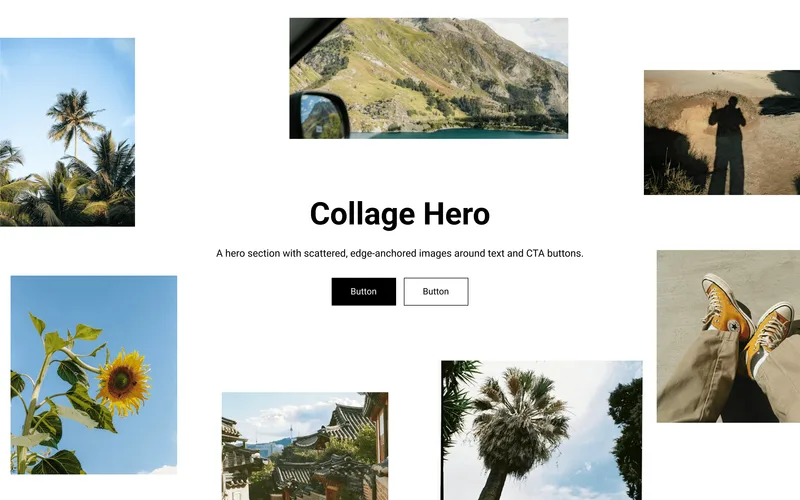
 Image Collage HeroA hero section with scattered, edge-anchored images around text and CTA buttons.Hero

What you can change
Inline Image System
Type [img1], [img2], etc. in the heading text field. Each tag is replaced with the matching Inline Image block, letting you place images anywhere within the headline.
Auto-Sized Images
Inline images automatically scale to match the heading's font size, so they stay proportional at any heading size and on any breakpoint.
Per-Button Colors
Each button block has its own base and hover color settings — background and text — for both filled and outline styles. Hover transitions smoothly across background, text, and border.
Layout and Style Controls
Text alignment (left/center), separate heading and description size controls for desktop and mobile, adjustable content width per breakpoint, per-image optional URL links, and full section padding controls.
Accessibility
Semantic HTML with proper image alt attributes and ARIA labels on all interactive elements.
Usage notes
How to Use the Inline Image System
Add Inline Image blocks. In the Theme Customizer, add one or more "Inline Image" blocks to the section. Each block has an image picker, alt text, and an optional link.
Write your heading with tags. In the section's Heading field, type your text and insert
[img1],[img2], etc. where you want each image to appear. The number corresponds to the order of your Inline Image blocks (first block =[img1], second =[img2], and so on).Example input:
Long [img1] heading is what you see here in [img2] this sectionThat's it. The Liquid code scans the heading text for each
[imgN]tag and replaces it with the rendered image (or a placeholder if no image is uploaded). Images automatically scale to match your heading's font size.
Tip: You can use as many inline images as you want — just keep adding Inline Image blocks and corresponding
[imgN]tags. If a tag has no matching block, it will simply render as plain text (the literal[img3]string).
props-inline-hero.liquid
{%- comment -%} Inline Image Hero | PROPS — https://props.tools/{%- endcomment -%} {% schema %}{ "name": "Inline Image Hero", "tag": "section", "class": "props-inline-image-hero", "disabled_on": { "groups": ["header", "custom.popups"] }, "settings": [ { "type": "header", "content": "Content" }, { "type": "text", "id": "heading", "label": "Heading", "default": "Use the tags [img1] to add inline images [img2] here", "info": "Use [img1], [img2], etc. to place inline images. Each tag maps to the corresponding Inline Image block." }, { "type": "richtext", "id": "description", "label": "Description", "default": "<p>Lorem ipsum dolor sit amet, consectetur adipiscing elit. Suspendisse varius enim in eros elementum tristique.</p>" }, { "type": "header", "content": "Typography" }, { "type": "select", "id": "heading_tag", "label": "Heading Level", "options": [ { "value": "h1", "label": "H1" }, { "value": "h2", "label": "H2" }, { "value": "h3", "label": "H3" } ], "default": "h1", "info": "Use H1 only once per page (usually the first section)." }, { "type": "range", "id": "heading_size_desktop", "min": 8, "max": 120, "step": 2, "unit": "px", "label": "Heading Size", "default": 64 }, { "type": "range", "id": "heading_size_mobile", "min": 20, "max": 80, "step": 2, "unit": "px", "label": "Heading Size (Mobile)", "default": 48 }, { "type": "range", "id": "body_size_desktop", "min": 12, "max": 24, "step": 1, "unit": "px", "label": "Description Size", "default": 16 }, { "type": "range", "id": "body_size_mobile", "min": 12, "max": 20, "step": 1, "unit": "px", "label": "Description Size (Mobile)", "default": 14 }, { "type": "header", "content": "Layout" }, { "type": "range", "id": "content_width_desktop", "min": 40, "max": 100, "step": 2, "unit": "%", "label": "Content Width", "default": 70 }, { "type": "range", "id": "content_width_mobile", "min": 80, "max": 100, "step": 2, "unit": "%", "label": "Content Width (Mobile)", "default": 92 }, { "type": "select", "id": "text_alignment", "label": "Text Alignment", "options": [ { "value": "left", "label": "Left" }, { "value": "center", "label": "Center" } ], "default": "center" }, { "type": "header", "content": "Inline Image Settings" }, { "type": "range", "id": "image_radius", "min": 0, "max": 24, "step": 2, "unit": "px", "label": "Image Border Radius", "default": 4 }, { "type": "header", "content": "Button Style" }, { "type": "range", "id": "button_radius", "min": 0, "max": 30, "step": 2, "unit": "px", "label": "Button Border Radius", "default": 4 }, { "type": "header", "content": "Section Padding" }, { "type": "range", "id": "padding_vertical_desktop", "min": 0, "max": 120, "step": 4, "unit": "px", "label": "Vertical Padding", "default": 80 }, { "type": "range", "id": "padding_horizontal_desktop", "min": 0, "max": 120, "step": 4, "unit": "px", "label": "Horizontal Padding", "default": 40 }, { "type": "range", "id": "padding_vertical_mobile", "min": 0, "max": 80, "step": 4, "unit": "px", "label": "Vertical Padding (Mobile)", "default": 40 }, { "type": "range", "id": "padding_horizontal_mobile", "min": 0, "max": 80, "step": 4, "unit": "px", "label": "Horizontal Padding (Mobile)", "default": 20 }, { "type": "header", "content": "Colors" }, { "type": "color", "id": "bg_color", "label": "Background Color", "default": "#FFFFFF" }, { "type": "color", "id": "text_color", "label": "Text Color", "default": "#121212" } ], "blocks": [ { "type": "inline_image", "name": "Inline Image", "settings": [ { "type": "image_picker", "id": "image", "label": "Image" }, { "type": "text", "id": "alt_text", "label": "Alt Text" }, { "type": "url", "id": "link", "label": "Link" } ] }, { "type": "button", "name": "Button", "settings": [ { "type": "text", "id": "label", "label": "Label", "default": "Button" }, { "type": "url", "id": "link", "label": "Link" }, { "type": "select", "id": "style", "label": "Style", "options": [ { "value": "filled", "label": "Filled" }, { "value": "outline", "label": "Outline" } ], "default": "filled" }, { "type": "header", "content": "Colors" }, { "type": "color", "id": "button_bg", "label": "Button Color", "default": "#121212" }, { "type": "color", "id": "button_text", "label": "Text Color", "default": "#FFFFFF", "info": "Applies to filled style. Outline uses Button Color for text." }, { "type": "color", "id": "hover_bg", "label": "Hover Color", "default": "#333333" }, { "type": "color", "id": "hover_text", "label": "Hover Text Color", "default": "#FFFFFF" } ] } ], "presets": [ { "name": "Inline Image Hero", "blocks": [ { "type": "inline_image" }, { "type": "inline_image" }, { "type": "button", "settings": { "label": "Button", "style": "filled", "button_bg": "#121212", "button_text": "#FFFFFF", "hover_bg": "#333333", "hover_text": "#FFFFFF" } }, { "type": "button", "settings": { "label": "Button", "style": "outline", "button_bg": "#121212", "button_text": "#FFFFFF", "hover_bg": "#121212", "hover_text": "#FFFFFF" } } ] } ]}{% endschema %} {% style %} .props-inline-image-hero-{{ section.id }} { background-color: {{ section.settings.bg_color }}; color: {{ section.settings.text_color }}; padding: {{ section.settings.padding_vertical_mobile }}px {{ section.settings.padding_horizontal_mobile }}px; --props-heading-size: {{ section.settings.heading_size_mobile }}px; --props-body-size: {{ section.settings.body_size_mobile }}px; --props-content-width: {{ section.settings.content_width_mobile }}%; --props-image-radius: {{ section.settings.image_radius }}px; --props-button-radius: {{ section.settings.button_radius }}px; } @media screen and (min-width: 750px) { .props-inline-image-hero-{{ section.id }} { padding: {{ section.settings.padding_vertical_desktop }}px {{ section.settings.padding_horizontal_desktop }}px; --props-heading-size: {{ section.settings.heading_size_desktop }}px; --props-body-size: {{ section.settings.body_size_desktop }}px; --props-content-width: {{ section.settings.content_width_desktop }}%; } } .props-inline-image-hero-container { max-width: var(--page-width, 1200px); margin: 0 auto; padding: 0 15px; box-sizing: border-box; } @media screen and (min-width: 750px) { .props-inline-image-hero-container { padding: 0 50px; } } .props-inline-image-hero-content { width: var(--props-content-width); max-width: 100%; } .props-inline-image-hero-{{ section.id }} .props-inline-image-hero-content { margin: {% if section.settings.text_alignment == 'center' %}0 auto{% else %}0{% endif %}; text-align: {{ section.settings.text_alignment }}; } .props-inline-image-hero-heading { color: inherit; margin: 0 0 16px 0; font-size: var(--props-heading-size); line-height: 1.15; font-weight: 700; } .props-inline-image-hero-inline-img { display: inline-block; height: 1.15em; height: 1lh; width: auto; vertical-align: middle; border-radius: var(--props-image-radius); object-fit: cover; } .props-inline-image-hero-inline-placeholder { aspect-ratio: 5 / 3; } .props-inline-image-hero-inline-link { display: inline-block; height: 1.15em; height: 1lh; vertical-align: middle; border-radius: var(--props-image-radius); overflow: hidden; line-height: 0; } .props-inline-image-hero-inline-link .props-inline-image-hero-inline-img { position: static; top: auto; border-radius: 0; } .props-inline-image-hero-description { margin: 0; } .props-inline-image-hero-description p { margin: 0 0 16px 0; font-size: var(--props-body-size); line-height: 1.5; opacity: 0.8; } .props-inline-image-hero-description a { color: inherit; text-decoration: underline; text-underline-offset: 0.3em; } .props-inline-image-hero-description p:last-child { margin-bottom: 0; } .props-inline-image-hero-buttons { display: flex; gap: 12px; flex-wrap: wrap; margin-top: 28px; } .props-inline-image-hero-{{ section.id }} .props-inline-image-hero-buttons { justify-content: {{ section.settings.text_alignment }}; } .props-inline-image-hero-btn { display: inline-flex; align-items: center; justify-content: center; padding: 12px 24px; font-size: 15px; font-weight: 500; text-decoration: none; border-radius: var(--props-button-radius); cursor: pointer; border: 1.5px solid var(--btn-bg); line-height: 1; transition: background-color 0.3s ease, color 0.3s ease, border-color 0.3s ease; } .props-inline-image-hero-btn-filled { background-color: var(--btn-bg); color: var(--btn-text); } .props-inline-image-hero-btn-outline { background-color: transparent; color: var(--btn-bg); } @media (hover: hover) { .props-inline-image-hero-btn:hover { background-color: var(--btn-hover-bg); color: var(--btn-hover-text); border-color: var(--btn-hover-bg); } }{% endstyle %} <div class="props-inline-image-hero-{{ section.id }}" data-section-type="props-inline-image-hero" data-section-id="{{ section.id }}"> <div class="props-inline-image-hero-container"> <div class="props-inline-image-hero-content"> {% if section.settings.heading != blank %} {%- liquid assign inline_images = section.blocks | where: 'type', 'inline_image' assign processed_heading = section.settings.heading | escape for img_block in inline_images assign img_index = forloop.index assign placeholder_tag = '[img' | append: img_index | append: ']' assign has_link = false assign img_alt = img_block.settings.alt_text | default: img_block.settings.image.alt | strip | escape if img_block.settings.link != blank and img_block.settings.image != blank and img_alt != blank assign has_link = true endif if img_block.settings.image != blank assign img_src = img_block.settings.image | image_url: height: 200 if has_link assign img_html = '<a href="' | append: img_block.settings.link | append: '" class="props-inline-image-hero-inline-link"><img src="' | append: img_src | append: '" alt="' | append: img_alt | append: '" class="props-inline-image-hero-inline-img" loading="eager"></a>' else assign img_html = '<img src="' | append: img_src | append: '" alt="' | append: img_alt | append: '" class="props-inline-image-hero-inline-img" loading="eager">' endif else assign placeholder_html = 'image' | placeholder_svg_tag: 'props-inline-image-hero-inline-img props-inline-image-hero-inline-placeholder' assign placeholder_html = placeholder_html | replace: '<svg', '<svg aria-hidden="true" focusable="false"' if has_link assign img_html = '<a href="' | append: img_block.settings.link | append: '" class="props-inline-image-hero-inline-link">' | append: placeholder_html | append: '</a>' else assign img_html = placeholder_html endif endif assign processed_heading = processed_heading | replace: placeholder_tag, img_html endfor -%} {%- assign heading_tag = section.settings.heading_tag | default: 'h1' -%} <{{ heading_tag }} class="props-inline-image-hero-heading">{{ processed_heading }}</{{ heading_tag }}> {% endif %} {% if section.settings.description != blank %} <div class="props-inline-image-hero-description">{{ section.settings.description }}</div> {% endif %} {%- liquid assign has_buttons = false for block in section.blocks if block.type == 'button' and block.settings.label != blank assign has_buttons = true break endif endfor -%} {% if has_buttons %} <div class="props-inline-image-hero-buttons"> {% for block in section.blocks %} {% if block.type == 'button' and block.settings.label != blank %} {%- if block.settings.link != blank -%} {%- assign button_tag = 'a' -%} {%- else -%} {%- assign button_tag = 'span' -%} {%- endif -%} <{{ button_tag }} {% if block.settings.link != blank %}href="{{ block.settings.link }}"{% endif %} class="props-inline-image-hero-btn props-inline-image-hero-btn-{{ block.settings.style }}" style="--btn-bg: {{ block.settings.button_bg }}; --btn-text: {{ block.settings.button_text }}; --btn-hover-bg: {{ block.settings.hover_bg }}; --btn-hover-text: {{ block.settings.hover_text }};" {{ block.shopify_attributes }} > {{ block.settings.label | escape }} </{{ button_tag }}> {% endif %} {% endfor %} </div> {% endif %} </div> </div></div> before you paste
Questions,
answered.
Do I need an app to add the Inline Image Hero?
No. The Inline Image Hero is one Liquid file, props-inline-hero.liquid, that you add to your theme’s code. Its styles, and its script where it has one, live inside that file, so there’s nothing to install and no monthly fee.
How do I put images inside the heading?
Type [img1], [img2] and so on in the heading where each image should sit. Each tag shows the matching Inline Image block, in order, and each image can link somewhere.
Will it work with my theme?
It works with Online Store 2.0 themes, the kind that let you add sections to any page from the theme editor. We test every section on Dawn. If it clashes with your theme, use Report an issue at the top of this page.
More like this
All sectionsImage Collage HeroA hero section with scattered, edge-anchored images around text and CTA buttons.Hero