 Scrolling Logo CarouselDisplay partner, client, or brand logos in a continuously scrolling ticker.Social ProofOct 2026
What you can change
Two Layout Modes
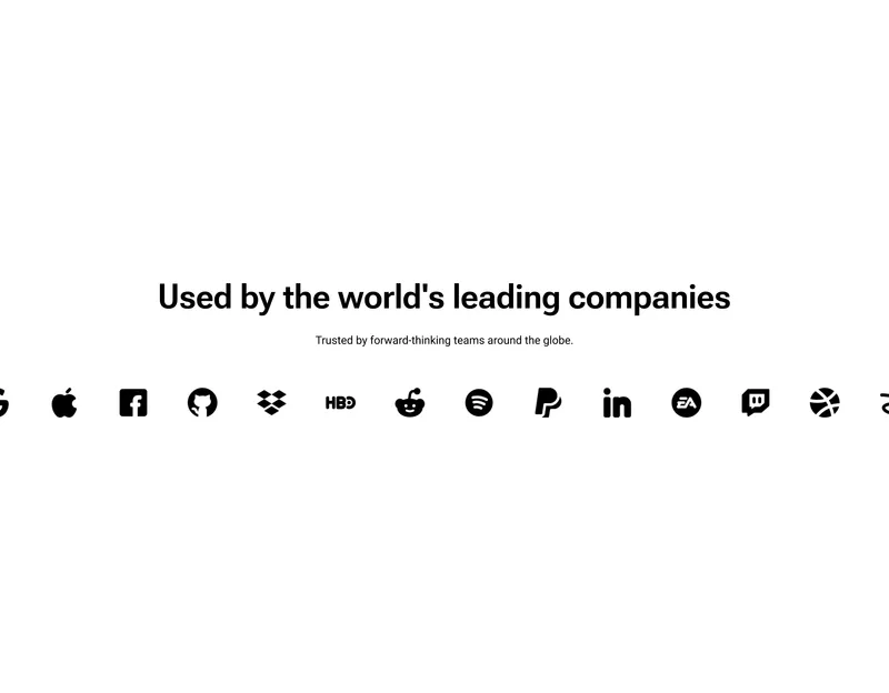
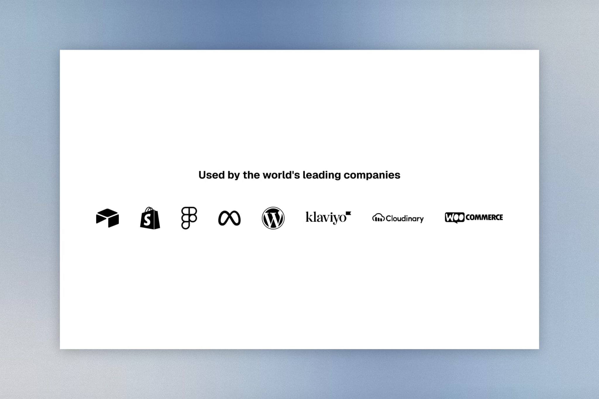
Stacked (text above grid) or Inline (text beside grid on desktop) for flexible section positioning.
Responsive Grid
Set 2–8 columns on desktop and 1–3 on mobile with independent control over grid gaps and layout density.
Grayscale & Hover Effects
Apply a global grayscale toggle to all logos that returns to full color on hover for a sleek, interactive feel.
Customizability
Per-logo links and text labels, configurable logo size for desktop and mobile, section heading with rich text description, full padding, background, and text color controls.
Accessibility
Semantic HTML with proper image alt attributes and ARIA labels on linked elements.
props-logos.liquid
{%- comment -%} Logo Grid | PROPS — https://props.tools/{%- endcomment -%} {% schema %}{ "name": "Logo Grid", "tag": "section", "class": "props-logo-showcase", "disabled_on": { "groups": ["header", "custom.popups"] }, "settings": [ { "type": "header", "content": "Layout" }, { "type": "select", "id": "layout_mode", "label": "Layout Mode", "options": [ { "value": "stacked", "label": "Top (Stacked)" }, { "value": "inline", "label": "Side (Inline)" } ], "default": "stacked" }, { "type": "header", "content": "Content" }, { "type": "text", "id": "heading", "label": "Heading", "default": "Used by the world's leading companies" }, { "type": "richtext", "id": "description", "label": "Description", "default": "<p>Trusted by forward-thinking teams around the globe.</p>" }, { "type": "header", "content": "Typography" }, { "type": "select", "id": "heading_align_desktop", "label": "Text Alignment", "options": [ { "value": "left", "label": "Left" }, { "value": "center", "label": "Center" }, { "value": "right", "label": "Right" } ], "default": "center" }, { "type": "select", "id": "heading_align_mobile", "label": "Text Alignment (Mobile)", "options": [ { "value": "left", "label": "Left" }, { "value": "center", "label": "Center" }, { "value": "right", "label": "Right" } ], "default": "center" }, { "type": "range", "id": "heading_size_desktop", "min": 12, "max": 60, "step": 1, "unit": "px", "label": "Heading Size", "default": 24 }, { "type": "range", "id": "heading_size_mobile", "min": 12, "max": 40, "step": 1, "unit": "px", "label": "Heading Size (Mobile)", "default": 20 }, { "type": "range", "id": "desc_size_desktop", "min": 12, "max": 32, "step": 1, "unit": "px", "label": "Description Size", "default": 16 }, { "type": "range", "id": "desc_size_mobile", "min": 10, "max": 24, "step": 1, "unit": "px", "label": "Description Size (Mobile)", "default": 14 }, { "type": "header", "content": "Spacing" }, { "type": "range", "id": "column_gap_desktop", "min": 0, "max": 100, "step": 4, "unit": "px", "label": "Column Gap", "info": "Gap between heading and logos. Bottom gap in Stacked, side gap in Inline.", "default": 40 }, { "type": "range", "id": "column_gap_mobile", "min": 0, "max": 60, "step": 4, "unit": "px", "label": "Column Gap (Mobile)", "default": 24 }, { "type": "header", "content": "Grid Settings" }, { "type": "range", "id": "cols_desktop", "min": 2, "max": 8, "step": 1, "label": "Columns", "default": 6 }, { "type": "range", "id": "cols_mobile", "min": 1, "max": 3, "step": 1, "label": "Columns (Mobile)", "default": 2 }, { "type": "range", "id": "gap_desktop", "min": 0, "max": 100, "step": 4, "unit": "px", "label": "Grid Gap", "default": 40 }, { "type": "range", "id": "gap_mobile", "min": 0, "max": 60, "step": 4, "unit": "px", "label": "Grid Gap (Mobile)", "default": 20 }, { "type": "header", "content": "Colors & Styling" }, { "type": "color", "id": "bg_color", "label": "Background Color", "default": "#FFFFFF" }, { "type": "color", "id": "text_color", "label": "Text Color", "default": "#000000" }, { "type": "checkbox", "id": "enable_grayscale", "label": "Enable Grayscale Filter", "info": "Applies a grayscale filter. Logos return to full color on hover (desktop).", "default": true }, { "type": "header", "content": "Logo Text" }, { "type": "color", "id": "logo_text_color", "label": "Logo Text Color", "default": "#000000" }, { "type": "range", "id": "logo_text_size", "min": 8, "max": 24, "step": 1, "unit": "px", "label": "Logo Text Size", "default": 12 }, { "type": "header", "content": "Section Padding" }, { "type": "range", "id": "padding_top_desktop", "min": 0, "max": 120, "step": 4, "unit": "px", "label": "Top Padding", "default": 60 }, { "type": "range", "id": "padding_bottom_desktop", "min": 0, "max": 120, "step": 4, "unit": "px", "label": "Bottom Padding", "default": 60 }, { "type": "range", "id": "padding_top_mobile", "min": 0, "max": 80, "step": 4, "unit": "px", "label": "Top Padding (Mobile)", "default": 40 }, { "type": "range", "id": "padding_bottom_mobile", "min": 0, "max": 80, "step": 4, "unit": "px", "label": "Bottom Padding (Mobile)", "default": 40 } ], "blocks": [ { "type": "logo", "name": "Logo", "settings": [ { "type": "image_picker", "id": "image", "label": "Image" }, { "type": "text", "id": "alt_text", "label": "Alt Text" }, { "type": "url", "id": "link", "label": "Link" }, { "type": "text", "id": "logo_text", "label": "Logo Text", "info": "Optional text displayed below the logo." } ] } ], "presets": [ { "name": "Logo Grid", "blocks": [ { "type": "logo" }, { "type": "logo" }, { "type": "logo" }, { "type": "logo" }, { "type": "logo" }, { "type": "logo" } ] } ]}{% endschema %} {% style %} .props-logo-showcase-{{ section.id }} { background-color: {{ section.settings.bg_color }}; color: {{ section.settings.text_color }}; padding-top: {{ section.settings.padding_top_mobile }}px; padding-bottom: {{ section.settings.padding_bottom_mobile }}px; --props-gutter: 20px; --props-column-gap: {{ section.settings.column_gap_mobile }}px; --props-heading-size: {{ section.settings.heading_size_mobile }}px; --props-heading-align: {{ section.settings.heading_align_mobile }}; --props-desc-size: {{ section.settings.desc_size_mobile }}px; --props-grid-gap: {{ section.settings.gap_mobile }}px; --props-grid-cols: {{ section.settings.cols_mobile }}; --props-logo-text-color: {{ section.settings.logo_text_color }}; --props-logo-text-size: {{ section.settings.logo_text_size }}px; {% if section.settings.enable_grayscale %} --props-filter: grayscale(1); --props-opacity: 0.7; {% else %} --props-filter: none; --props-opacity: 1; {% endif %} } @media screen and (min-width: 750px) { .props-logo-showcase-{{ section.id }} { padding-top: {{ section.settings.padding_top_desktop }}px; padding-bottom: {{ section.settings.padding_bottom_desktop }}px; --props-column-gap: {{ section.settings.column_gap_desktop }}px; --props-heading-size: {{ section.settings.heading_size_desktop }}px; --props-heading-align: {{ section.settings.heading_align_desktop }}; --props-desc-size: {{ section.settings.desc_size_desktop }}px; --props-grid-gap: {{ section.settings.gap_desktop }}px; --props-grid-cols: {{ section.settings.cols_desktop }}; } } .props-logo-container { width: 100%; max-width: var(--page-width, 1200px); margin: 0 auto; padding-left: var(--props-gutter); padding-right: var(--props-gutter); box-sizing: border-box; } .props-logo-wrapper { display: flex; flex-direction: column; width: 100%; gap: var(--props-column-gap); } .props-logo-header { width: 100%; text-align: var(--props-heading-align); } .props-logo-heading { display: block; font-size: var(--props-heading-size); text-align: var(--props-heading-align); color: inherit; margin: 0 0 12px 0; line-height: 1.2; font-weight: 600; } .props-logo-description { display: block; font-size: var(--props-desc-size); text-align: var(--props-heading-align); color: inherit; margin: 0; line-height: 1.5; opacity: 0.8; } .props-logo-description p { margin: 0; } .props-logo-description a { color: inherit; text-decoration: underline; text-underline-offset: 0.3em; } .props-logo-grid { display: grid; grid-template-columns: repeat(var(--props-grid-cols), 1fr); gap: var(--props-grid-gap); width: 100%; align-items: center; justify-content: center; } .props-logo-item { display: flex; flex-direction: column; justify-content: center; align-items: center; width: 100%; aspect-ratio: 3/2; position: relative; text-decoration: none; transition: opacity 0.3s ease; } .props-logo-img { max-width: 100%; max-height: 100%; width: auto; height: auto; object-fit: contain; filter: var(--props-filter); opacity: var(--props-opacity); transition: filter 0.3s ease, opacity 0.3s ease, transform 0.3s ease; } .props-logo-item:hover .props-logo-img { filter: none; opacity: 1; } .props-logo-text { display: block; text-align: center; font-size: var(--props-logo-text-size); color: var(--props-logo-text-color); margin-top: 8px; line-height: 1.3; font-weight: 400; } @media screen and (min-width: 990px) { {% if section.settings.layout_mode == 'inline' %} .props-logo-wrapper { flex-direction: row; align-items: center; justify-content: space-between; } .props-logo-header { width: 35%; flex-shrink: 0; } .props-logo-grid { width: 65%; } {% endif %} } @media screen and (max-width: 989px) { .props-logo-wrapper { flex-direction: column; } }{% endstyle %} <div class="props-logo-showcase-{{ section.id }}"> <div class="props-logo-container"> {% if section.blocks.size > 0 or section.settings.heading != blank %} <div class="props-logo-wrapper"> {% if section.settings.heading != blank or section.settings.description != blank %} <div class="props-logo-header"> {% if section.settings.heading != blank %} <h2 class="props-logo-heading">{{ section.settings.heading | escape }}</h2> {% endif %} {% if section.settings.description != blank %} <div class="props-logo-description">{{ section.settings.description }}</div> {% endif %} </div> {% endif %} <div class="props-logo-grid"> {% for block in section.blocks %} {% liquid assign has_link = false if block.settings.link != blank assign has_link = true endif assign placeholder_index = forloop.index | modulo: 6 %} {% if has_link %} <a href="{{ block.settings.link }}" class="props-logo-item" {{ block.shopify_attributes }}> {% else %} <div class="props-logo-item" {{ block.shopify_attributes }}> {% endif %} {% if block.settings.image != blank %} {{ block.settings.image | image_url: width: 600 | image_tag: loading: 'lazy', class: 'props-logo-img', alt: block.settings.alt_text | default: block.settings.image.alt, widths: '165, 360, 535, 750', sizes: '(min-width: 990px) 15vw, (min-width: 750px) 25vw, 50vw' }} {% else %} <svg class="props-logo-img" width="120" height="40" viewBox="0 0 120 40" fill="currentColor" xmlns="http://www.w3.org/2000/svg" style="max-height: 40px;"> {% case placeholder_index %} {% when 1 %} <path d="M20 20L10 0H30L20 20ZM20 20L30 40H10L20 20Z" fill="currentColor"/> <rect x="40" y="12" width="60" height="16" rx="2" fill="currentColor"/> {% when 2 %} <circle cx="20" cy="20" r="15" fill="currentColor"/> <rect x="45" y="15" width="55" height="10" rx="2" fill="currentColor"/> {% when 3 %} <rect x="5" y="5" width="30" height="30" rx="4" fill="currentColor"/> <path d="M50 15H100V25H50V15Z" fill="currentColor"/> {% when 4 %} <path d="M15 35V5L35 20L15 35Z" fill="currentColor"/> <rect x="45" y="12" width="50" height="16" rx="2" fill="currentColor"/> {% when 5 %} <path d="M20 5L35 35H5L20 5Z" fill="currentColor"/> <circle cx="55" cy="20" r="5" fill="currentColor"/> <rect x="70" y="15" width="40" height="10" rx="2" fill="currentColor"/> {% else %} <rect x="5" y="10" width="20" height="20" rx="10" fill="currentColor"/> <rect x="30" y="10" width="20" height="20" rx="0" fill="currentColor"/> <rect x="60" y="15" width="50" height="10" rx="2" fill="currentColor"/> {% endcase %} </svg> {% endif %} {% if block.settings.logo_text != blank %} <span class="props-logo-text">{{ block.settings.logo_text | escape }}</span> {% endif %} {% if has_link %} </a> {% else %} </div> {% endif %} {% endfor %} </div> </div> {% endif %} </div></div>More like this
All sectionsScrolling Logo CarouselDisplay partner, client, or brand logos in a continuously scrolling ticker.Social ProofOct 2026